Come Home: how South Yorkshire Housing Association’s brand communicates our purpose
Celebrating our award for Landlord of the Year, November 2021
Project date: 2018
Team:
Customers and employees of South Yorkshire Housing Association - brand inspiration
IF Collective - brand agency
Justine Gaubert - client advisor
South Yorkshire Housing Association’s Marketing & Communications team - client, brand development & delivery
At South Yorkshire Housing Association we are delighted to have been named Landlord of the Year in the UK Housing Awards.
We are proud that, in a year that was dominated by Covid-19 and concerns about racial injustice, we delivered effectively on these two big challenges and, at the same time, held firm to our purpose: with South Yorkshire Housing Association you can settle, live well and realise your potential.
As part of our submission, we had to create a 10-minute video setting out evidence from our customers and stakeholders on our impact and excellent service delivery in the last year.
The video we submitted for the award captures powerfully our shared purpose and communicates the essence of who we are. As our Chief Executive said, it passes the “tippex” test – you couldn’t replace our name with another organisation, it is distinctively South Yorkshire Housing Association.
Our video submission captures the strength and integrity of our brand: how our images, stories, evidence and tone of voice come together to articulate and communicate our values and purpose.
This blog tells the story of how we developed our brand.
#1 Why we felt the need to rebrand;
#2 How we worked with our customers and employees;
#3 The elements of the brand; and
#4 How they are applied in a range of beautiful brand assets.
#1 Why did we need to rebrand?
South Yorkshire Housing Association rebranded three years ago. Why did we do this? Three reasons:
# We had changed
The simple answer to the question of why we needed to rebrand is that we have changed so much in the last few years that our old brand just wasn't working for us anymore:
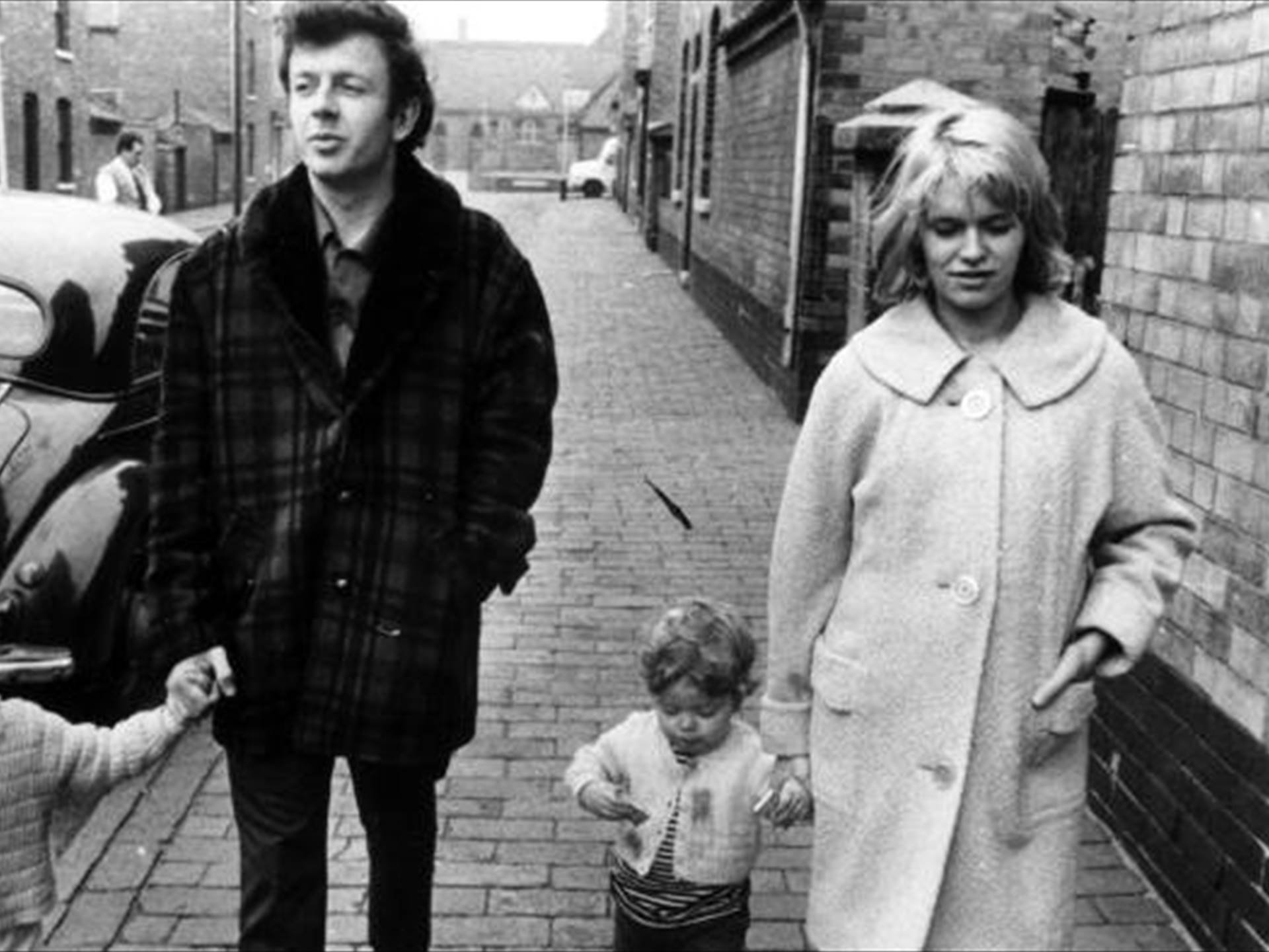
# It didn't connect to our history as a Cathy Come Home association.
# It wasn't sufficiently flexible to adapt to all the new activity and partnerships we have developed in the last few years and, as a result, we had created multiple brands and sub-brands which left our customers and stakeholders confused as to who we are and what we do.
# And it didn't reflect the full range of our organisational purpose: with South Yorkshire Housing Association you can settle at home, live well and realise your potential.
# We had developed a new shared purpose
In 2013, when I joined South Yorkshire Housing Association, the business was struggling to create a compelling narrative or purpose that linked the different parts of our business: our landlord services, our care and support services and our commercial activity.
We were looking for our Jim Collins “hedgehog”, our equivalent to NASA’s “we’re here to put a man on the moon”.
As a fresh pair of eyes, I felt I could see the connections clearly. Working with colleagues, the Board and our customers we evolved a new narrative.
We started with our why: inspired by Simon Sinek’s The Power of Why we thought deeply about what got each and every one of us out of bed in the morning and kept us focused on our customers. This wasn’t about things we did, like building affordable homes or delivering high quality services – it was about the difference we make by doing those things.
And then we formulated those imperatives into a set of five statements that were influenced by Maslow’s hierarchy of needs model:

# Being settled at home is the foundation of living well
# It’s not enough just to have a roof over your head. A house becomes a home when the people living there feel safe and well.
# The purpose of our work is ultimately for people to enjoy their lives to the full and realise their potential.
# We want your experience with us to be a joy.
# We will be here for the long term, and to have the maximum impact we will continue to innovate, improve and grow.
And we summarised it in a nutshell: with South Yorkshire Housing Association you can settle at home, live well and realise your potential.
Our previous brand didn’t align fully with our newly articulated purpose.
# We wanted to strengthen our culture and employee engagement
We know that businesses with a positive culture and high employee engagement deliver better customer service and financial performance. We are lucky to have a truly wonderful culture, driven by the personality and practice of Tony Stacey, our Chief Executive for over 25 years, by our sustained investment in leadership and by a diverse workforce.
But culture is not just about behaviours, it is also about “artefacts”, the things people witness in their working environment.
Brand is a critical cultural “artefact”: it runs through all our communications, internal and external; all our activities – the look and feel of our homes, gardens and workspaces; and all of our service delivery.
We needed a brand that would make visible who we are and what we stand for.
#2 Co-designing our brand


Having decided to rebrand, how could we make sure our new brand would be authentic and represent who we are?
We had previously worked with IF Collective on how our workspaces could articulate our purpose. They did a really brilliant job of getting under the skin of who we and our customers are.
So, we asked IF Collective to work with us to develop a brand that told our story and expressed our purpose. And we asked Justine Gaubert, who had previously worked both with us and with IF Collective, to support me as client, to commission and develop the new brand.
IF Collective already knew us well but they got to know us even better. Most importantly, they started with our customers, giving clarity to how they experience and access our hugely diverse range of services. They spent some weeks visiting our services, listening to our customers and talking to our employees and our Board.
At the end of this time they were ready to share their ideas with me and Justine. Over several iterations and with the help of Justine’s insight, they refined the proposals. Justine and I were ready to share their thinking with the business.

We started with our Directors’ Team. IF Collective’s rationale and presentation was clear, compelling, and rooted in our customers. The proposals were accepted without any changes. The same happened when the proposals were presented to the Board and to the rest of the business.
A painless brand development - who knew that was possible?
IF Collective’s listening and thinking is so excellent, their understanding of and empathy with our values so robust and their design skills so imaginative that it makes working with them a joy. We have retained them for all our brand work both in the main business and in our commercial subsidiaries.
#3 Our new brand
Our new brand is made up of several elements:
# Our name

So did we change our name? Absolutely not. We are a housing association that is rooted in South Yorkshire and we work exclusively in Sheffield City Region.
We are sticking with our name: it's who we are. But we will use our full name when we talk to external audiences and reserve our acronym (SYHA) for internal communication.
# A motto
IF Collective identified that our name is very factual, it "does what is says on the tin" and they wanted to add something that conveyed our passion for what we do.
They didn't want a strapline because these are usually used to sell things and that's just not our style. Instead we have adopted a motto, something that we can believe in, that adds some "heart" to our name and also connects to our story, our Cathy Come Home origins, that offers a direct line of sight to the founding of the organisation.
That motto is simply Come Home. Come home is not just about houses: it’s about coming home to your town, your neighbourhood, your house, yourself.
# Brand icons

And to embody our purpose we have three brand icons to use with the name and our motto:

# a map pin for settle
# a house for live well and
# a heart for realise your potential.
These are supported by a range of other icons that express what it means to be settled (a pint of milk on the doorstep, a big light, a comfy sofa etc), to live well (a cooker, a pet, a plant etc) and to realise potential (tools for work, bright ideas etc). The icons bring joy.
Jonny Wilkinson, our in house graphic designer, has done a brilliant job of expanding our library of icons to suit a multitude of purposes while keeping the brand intact.
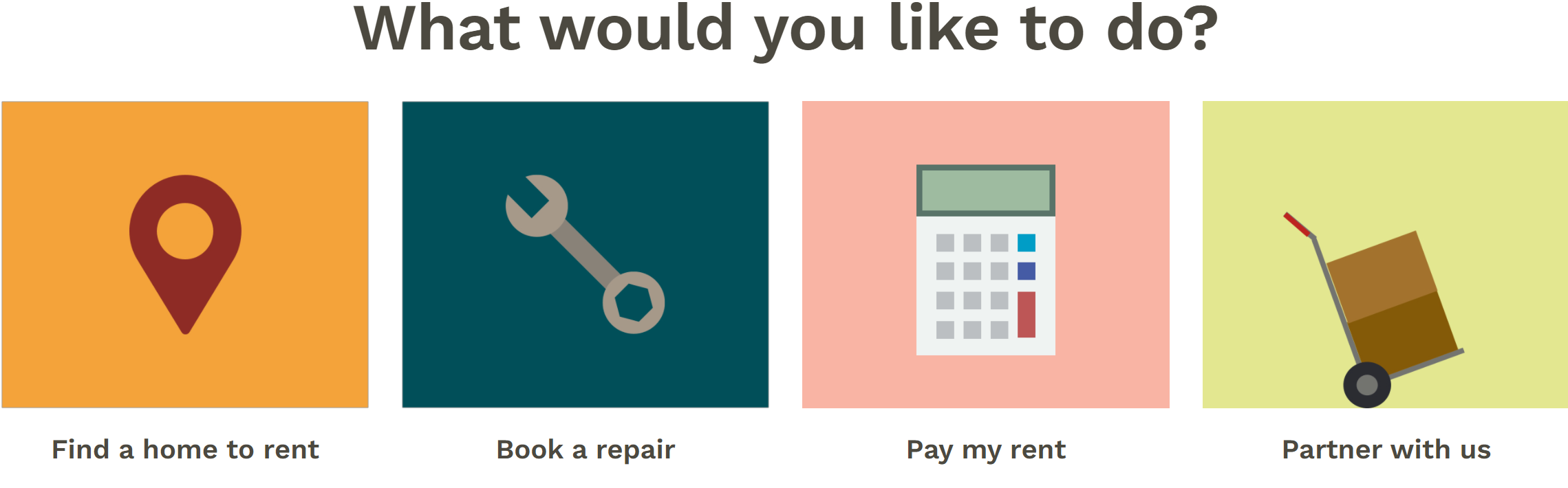
By deploying the icons we’ve been able to move away from sub-brands.
# Photography


Apart from our name, how can we communicate through our brand that we are "from round here"?
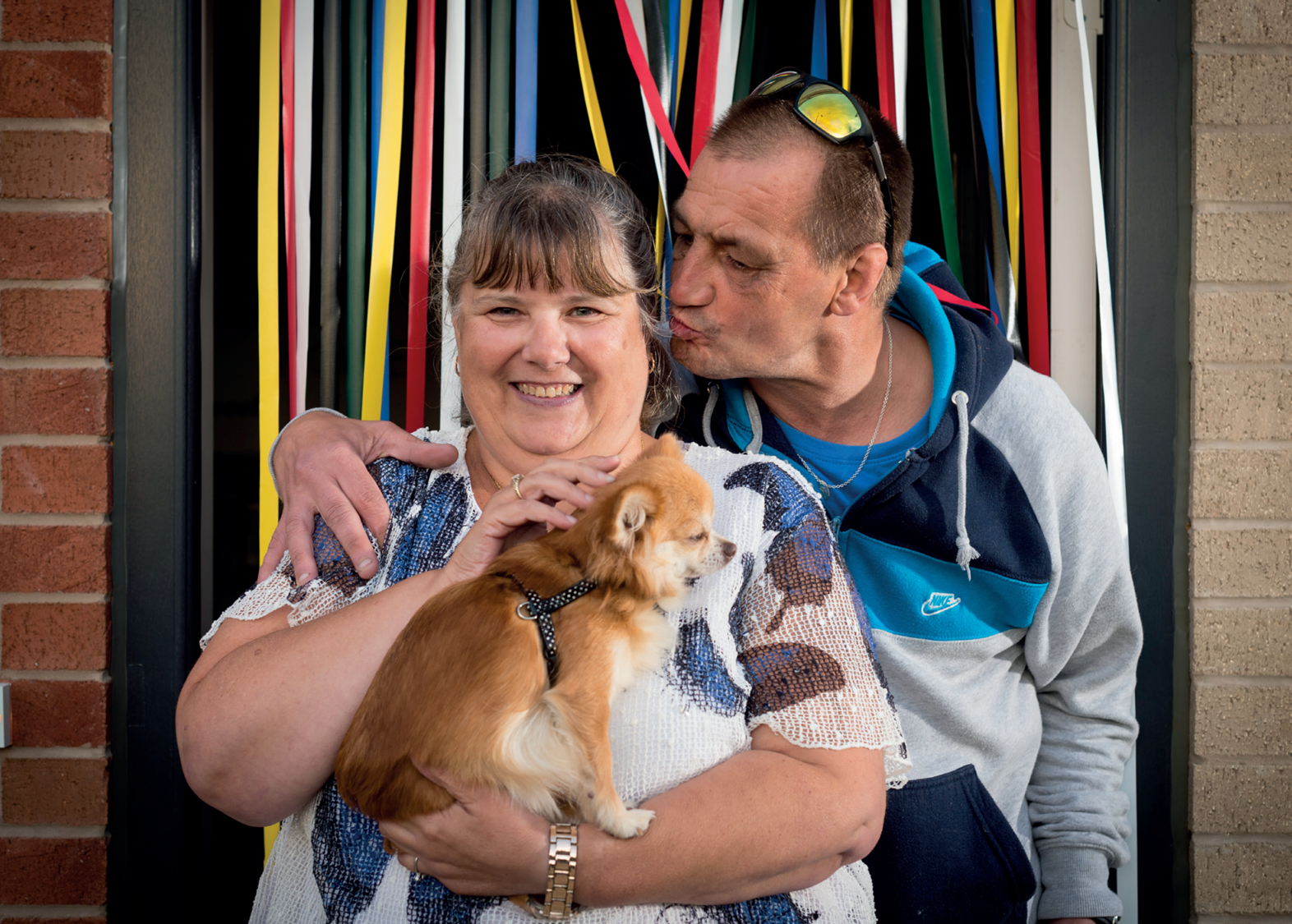
We have taken inspiration from our customers.
Our customers are a diverse bunch and we want all the images we use to tell their stories: our customers will be front and centre in all of our communications.
# Colours


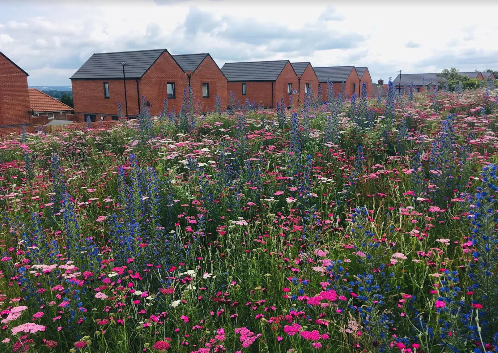
We have drawn on the landscape of South Yorkshire to inform our colour palette: brick red, sandstone yellow, woodland and grassy greens, river and sky blues, steel grey.
There won't be one corporate colour, we will use all of the colours we see around us.
# Typography

Our typography is a contemporary version of a typeface developed by Stephenson Blake, founded in Sheffield in 1818 and one of the most prestigious type foundries in England during the Victorian era.
It is a modern version of something local and world class.
# Tone of voice
Our tone of voice takes inspiration from our customers and our values: it is warm, human, robust and brave. It feels authentic and local without being “folksy” or patronising.
Every detail of our brand talks of who we are, what we do and where we come from.
# 4 Applying the brand elements
IF Collective delivered us a beautiful and flexible set of brand assets that we have been able to apply, both with and without their help, on a broad range of assets.
Whether it is a report, a presentation, our new website, our intranet, our vans or, indeed, the design of our homes and workplaces, the elements come together to create an authentic and coherent whole.


Our new brand has met our brief in full: it covers the full range of what we do, it articulates our purpose and it has strengthened our culture.
Afterword
The video we created for the Landlord of the Year award paints a really good picture of our work and impact.
When we shared it with a group of 75 managers at the shortlisting stage (before we knew we had won!) the overwhelming response was of pride and inspiration.
“What a fantastic video, I feel so proud to work for SYHA.”
“Such an inspiring video, it’s easy to forget just how much brilliant support has been provided in what’s been a very challenging year. ”
Our brand runs through every aspect of the video: the images, the icons, the colour palette, the tone of voice and the buildings we manage all come together to express our purpose.