A new works depot for South Yorkshire Housing Association: what makes the design uniquely ours?

Celebrating our new Depot
Project date: 2022
Our very Sheffield team:
HEM Architects - Alasdair Struthers
93ft, interior design - Jim Butterell
IF Collective, design briefing - Andy Turner
Precision Group Ltd, construction - Ben Thurston, Nick Waller
South Yorkshire Housing Association, client - Gareth Wallace-Parkin, Matteo Martini
At South Yorkshire Housing Association we have brought our Home Maintenance Team and our Neighbourhood Estate Action Team together in a new, shared depot.
The site is in the back of beyond: under the railway bridge, past the container yard, past the cement works, the last plot on a sprawling industrial estate. When we found it, it comprised a big yard, three tired portakabins and a concrete pebbledash shed. Not very prepossessing at first glance.
It was really important to us that the workspace was of the same character and quality as our head office at Rockingham Street in Sheffield city centre, albeit with the design adapted to fit the ways of working of these teams. We want all our employees to feel equally valued. And we want all of our workspace to showcase who we are, what we do and where we come from.
So we used a similar design process to the rest of our workspace. First we ran a consultation with the teams, facilitated by our brand consultants, IF Collective. The sessions focused on how the teams work day to day and what they need from the space. This generated a design brief which we gave to our architects, HEM architects, and our interior designer, 93 ft.
The design team drew up proposals that built on the design language we have developed for the rest of our workspace, a design language that relates directly to our brand.
The result is a depot like no other. What makes the design of this depot and the rest of our workspace uniquely South Yorkshire Housing Association's?
In a nutshell the design language reflects:
#1 The South Yorkshire landscape
#2 The homes we build
#3 Our brand
#4 Our values
#1 It draws on South Yorkshire's landscape
Sheffield is built on seven hills. Its topography creates a unique urban character: the hills, woods and rivers originally powered the cutlery and steel industry and now they support our quality of life. Other towns in South Yorkshire share these landscape features.
The design at Rockingham Street mirrors the city's landscape.
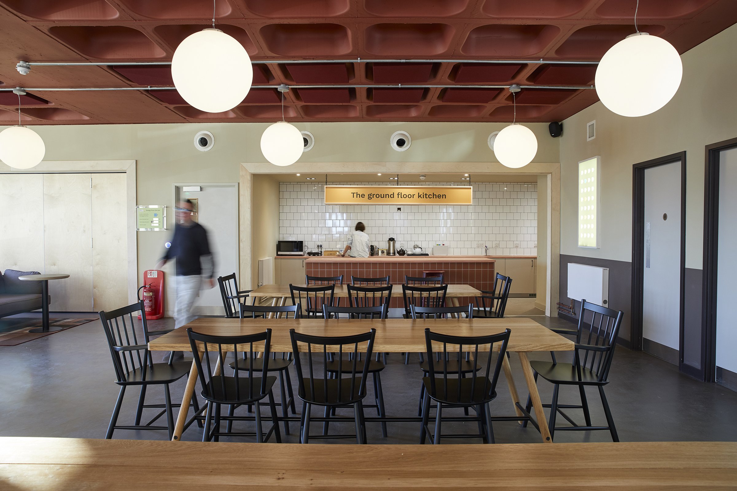
On the ground level the concrete floor, brick red paintwork and terracotta carpet connect to the earth. This is the welcoming heart of the building, a place to make a brew, eat lunch and meet. And a place for celebration events.

On the "office" floors above the carpet, furniture and paintwork is mainly green, evoking grassland and wooded slopes.


On the top floor the colours in the paintwork, fabrics and flowers are sky blue. This floor hosts The View, a workshop and large meeting space with fantastic views over the city and beyond.
When I first moved to Sheffield I was struck by the fact that you could see the edge of the city, the countryside, from the city centre: from the window seats and roof garden at Rockingham Street you can see as far as the Peak District.


The three portakabins at the Depot follow a similar theme.
The first, the Canteen, is painted red and replicates the functions of the ground floor at Rockingham Street: arrival point, kitchen, comfortable seating, informal meeting space.


The second, the Office, is painted green. It is the office, with the same desking and break out spaces as the work floors at Rockingham Street.


The third, the Workshop, is painted yellow and reflects the uses of the top floor at Rockingham Street: confidential meeting space, workshop and training space. We opted for yellow not blue this time: yellow for sun and for sandstone. We don't see many blue exteriors round here.


There is no roof garden with a portakabin. But we do have a sunny garden space and cycle store at the entrance to the site, outside the Canteen.
And although you can't see the Peak District from here, you look onto woodland beyond the site boundary.
#2 It's made of the same stuff as our homes
At Rockingham Street the building is brick with stone details. The new cladding and the window frames are slate grey. Metal details are everywhere: the legs on the desks, the tables, the frames of the moveable flip boards. There are terracotta tiles on the high tables and in the kitchens.
The Depot uses the same materials and furniture, although work boots and smaller floor areas have meant more robust floor coverings. The ugly shed has been clad in black.


Timber runs throughout the interiors at Rockingham Street: the ply spine wall, reclaimed timber for the "kitchen" table tops, recycled parquet on the table in the big table meeting room, the roof terrace decking and seats.
The rooftop planting evokes the greenery of South Yorkshire and the "pictorial" meadow flowerscapes that have become a hallmark of the region.
The Depot cabins are lined in ply and the furniture matches that of our head office.


As well as referencing the materials we use for building our new homes, there are details that are uniquely ours.
On the ground floor at Rockingham Street we have bespoke concrete worktops for the kitchen island and the welcome desk. We started with the idea of a terrazzo product, chosen because it used recycled materials. But it came from Italy. We wanted to use a product made in Kelham Island in Sheffield, close to Dun Works, one of our biggest housing schemes. So we asked Kelham Concrete to make a worktop using products recycled from our homes by our Home Maintenance Team - washbasins and crockery - a nice link between this building and the Depot.


The carpets in Rockingham Street have been designed by Jonny Wilkinson, artist and in-house graphic designer. He took as his inspiration the design of our homes, domestic fittings and gardens. The images were morphed into a beautiful abstract collage, terracotta pink on the ground floor, green on the upper floors.
These materials also appear in South Yorkshire Housing Association's homes.
#3 It uses our brand to show who we are
We have recently rebranded with the help of IF Collective.
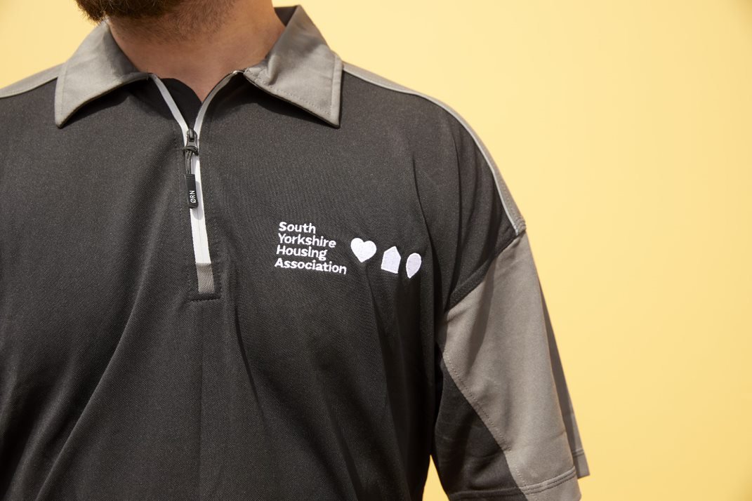
Three brand icons support the motto linked to our purpose: a map pin for settle, a house for live well and a heart for realise your potential. The colours in our brand derive from the landscape of South Yorkshire.
At the main entrance to Rockingham Street we have three signs:
# the map pin icon has been etched into a piece of stone by Sheffield artist Steve Roche and embedded in the threshold;
# the house icon has been manufactured in metal and mounted on the wall alongside our name;
# the heart icon is incorporated in a welcome sign placed in the window of the ground floor reception and lit at night.


Our mugs, also designed by Jonny Wilkinson, our uniforms, our lanyards and our vans use these and other brand icons.


Part of our brand is about plain-speaking: our name for example. So all of the spaces in Rockingham Street - and indeed the building itself - follow this rule: 152 Rockingham Street, the round table room, the big table room, the tiny room, The View (on the top floor), wall and window snugs.
At the Depot the signs on each portakabin follow the same discipline: the Canteen, the Office and the Workshop say exactly what they do on the tin.


And our brand also takes inspiration from our customers. Our customers are a diverse bunch and we want all our communications to tell their stories. That's why the main spiral staircase that runs the height of Rockingham Street and the walls at the Depot are full of quotes and images of our customers.
The details talk of who we are, what we do and where we come from.
#4 It makes visible our values
As well as our commitment to our customers and our place, our workspace demonstrates our commitment to diversity and to the planet.
The buildings aspire to a progressive approach to equality diversity and inclusion: for example, gender neutral toilets (and more toilets for women overall!), toilet cubicles that include washbasins (essential for the menopause - and suggested by one of our male colleagues), fully accessible buildings, images that celebrate the diversity of our customers and employees, spaces for a diverse cultural calendar of events, flexible work spaces that suit different individuals' preferences.


Reusing existing buildings is the starting point for our workspace as well as a focus on insulation, natural light, natural ventilation (all windows can be opened, no aircon), and natural and reclaimed materials. Electric vehicle charging points, cycle racks and showers support low carbon travel. Recycling bins, white boards & digital screens reduce waste. A PV counter at Rockingham Street reminds us that the building uses solar power. The exposed concrete ceiling helps cool and heat the building. LED and passive infrared lighting reduces energy use. Hand driers (no paper towels), zip taps and oat milk are everyday prompts.


Visual cues highlight diversity and environmental sustainability.
The design language in our workspaces tells our story.
These couldn't be anyone else's buildings.
To find out more about South Yorkshire Housing Association and what we do, visit our website.